Do you have trouble reading things on your iPhone’? Here are 6 things you can do to make your phone more accessible.
Your iPhone is a nice device; it’s solid, efficient and reliable. But the text on the screen isn’t always easy to read. First of all because of its size: compared to other smartphones, the iPhone 5’s 4 inches seem small. Then there’s the iOS 7 design: although it’s beautiful and elegant, the default font is so thin it’s not always easy to read.
But don’t worry, there are 6 things you can do to improve the accessibility of your iPhone running iOS 7.
Activate Bold Text
First of all, try to activate bold text as the default font. To do so, go to Settings > General > Accessibility and select Bold Text.
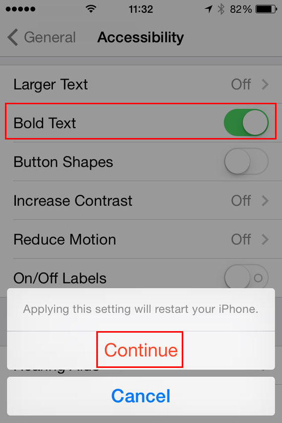
To apply this setting you’ll have to restart your iPhone.
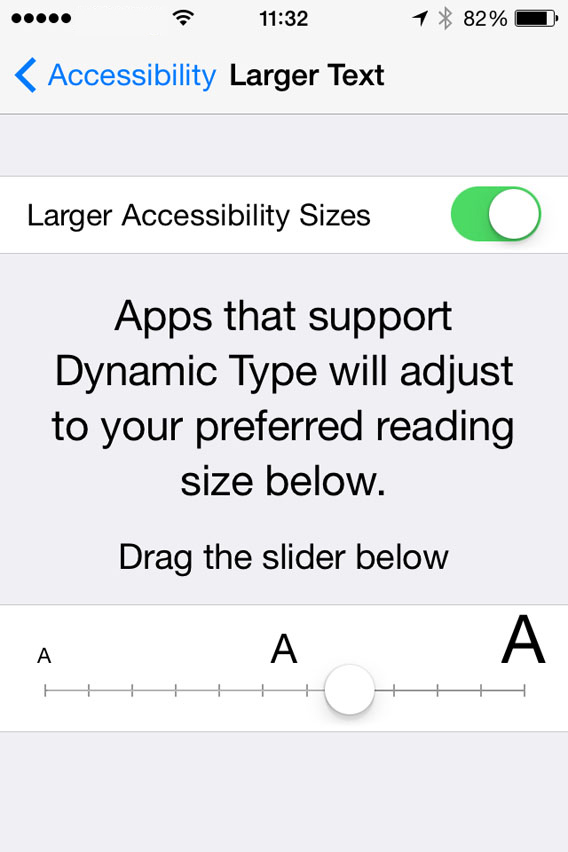
Increase the text size
If you’re still having trouble reading the text, you can make the font size bigger. To do so, go to Settings > General > Accessibility and select Larger Text. You can choose the font size you want by dragging the slider along the horizontal bar.
Activate zoom
Zoom substantially magnifies all the content on the screen. You can activate it by going to Settings > General > Accessibility > Zoom. To zoom in, double-tap the screen with three fingers. If you want to move around the screen, move three fingers around the screen.
Only the area you double-tap on will zoom in.

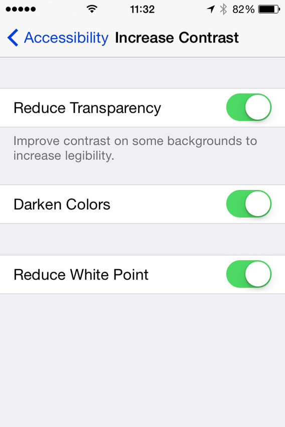
Increase contrast
In Settings > General > Accessibility > Increase Contrast you have three options that might improve your reading experience.
The first is Reduce Transparency, to increase the contrast on the backgrounds. The second is Darken Colors. The third, Reduce White Point. Try all three, together or separately, until you are happy with the result.
Invert Colors
The Invert Colors option creates a negative of what you see on the screen which, for some people and in some cases, can make the text easier to read. If the other solutions haven’t worked, you can try this. One thing is certain: if you invert the colors your iPhone will look very original!
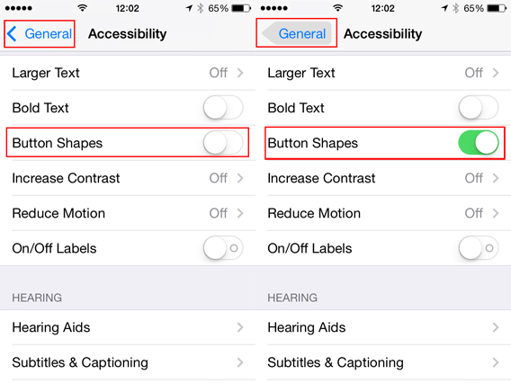
Activate Button Shapes
The minimalist design of iOS 7 can sometimes make it difficult to identify what part of the text you can see is a button. To overcome this problem, you can enable Button Shapes on Settings > General > Accessibility.
Optimize the screen? Easy!
Thanks to these accessibility tools that Apple has added to iOS 7, most people can the right formula to enjoy their iPhone without straining to see, and without sacrificing the benefits of Apple’s smartphone.
If you want to know more about iOS 7, check out our guide.