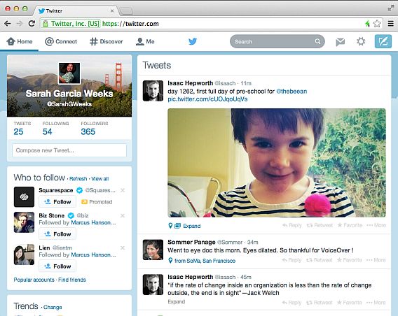
Twitter has changed its web interface to look more like its mobile apps. The first conclusion is obvious: we are moving towards unified interfaces. The second: Twitter was ugly.
For social networks, aesthetics are important. Your profile is a mirror, a calling card. It needs to shine. If a social network can’t deliver, not only are we not going to spend much time there, we also won’t be recommend it to other. This is what leads to decline in a social network. Naturally, Twitter can’t allow that to happen.
More emphasis on your profile
Twitter’s classic design as viewed from the desktop browser was nothing special. It was functional and to some extent light, but hardly renowned for its looks. Profile pages in Google+ are much easier on the eye. G+, for example, displays a large profile picture at all times. It serves as a constant reminder of who we are.

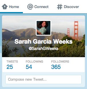
Top left: the new ‘calling card’ is the heart of Twitter
In the new design, Twitter gives greater prominence to the ‘calling card’, a combination of name, profile picture, background, and clearly visible numbers. It’s like looking at ourselves in the rear-view mirror. In the world of social networking, ego is the fuel, and seeing ourselves in a nice setting increases self-confidence.
A single, unified design
The second consequence of Twitter’s redesign is not new: all the best services are currently aiming to unify their interfaces. There’s no reason why using Twitter or Facebook on a desktop PC should be significantly different to using them on a phone or tablet. Some formatting changes, maybe, but the experience should be the same.

This convergence shows the browser as an information viewer, a window in which to load hypertext, but also a small operating system inside another operating system. The pages we use every day look like applications because they are: they no longer look different from the apps we use on our phones.

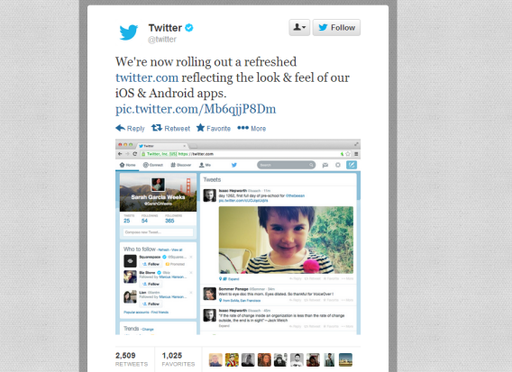
Twitter’s announcement was met with sarcasm by many users
Now, combining interface unification with usability and attractive design is difficult. Twitter seems to have made the right decisions, but it should be very careful with any design changes: one false move and you’ve broken millions of ‘social mirrors’.
What do you think of Twitter’s new design?

