As software goes, the Seesmic franchise is a well-oiled machine. Even though it’s not a particularly popular Twitter client, it gets a huge amount of buzz, so I’m guessing there’s some really good social marketers in the mix. Well hype doesn’t make an app – when the first version of Seesmic came out, I was ambivalent. By the time version 2 hit my desk for review, it had morphed into fully-fledged dislike. Seesmic Desktop sucks!
Size
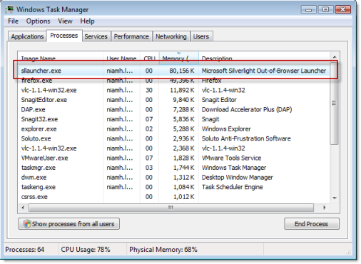
There’s no denying it – Seesmic is a behemoth of an app, sprawling across the screen and spilling out of my virtual machine. It can be resized, but it doesn’t really help – there’s so much stuff on the screen that you’re going to cut out content by making the window smaller. And that’s just looking at the software – a peek at your system resources will show you that’s it’s also sucking the lifeblood out of your poor computer. For an app that, as I will show you below, isn’t even that attractive, it’s a pretty big price to pay.
Support
Fair play to Seesmic for expanding its supported services, but the selection they have just doesn’t cut it. Twitter, LinkedIn and Facebook are all good, but the remaining services – foursquare, Google Buzz and Ping.fm – are a ragtag group of social media apps which, apart from having nothing in common, are some of the least popular in their categories. If you are going to try multi-service support, that’s great, but you need the resources to make it the ones people use – and lots of them. If you can’t do that, just focus on one, and try to make it the best client there is.
Appearance
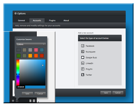
Don’t worry, I’m not that shallow. When it comes to a good app, looks aren’t everything, but as in life, it sure helps. In previous versions of Seesmic, one of the complaints heard over and over was that there was very little opportunity for customization. Well, this version has pushed the boat out, but not much. There’s now a selection of Seesmic backgrounds and colors, but the part of the screen where you can actually see the change is minute – it’s more like a border. What’s more, you can add and remove columns inside the app, but as you click on each new category, it adds a column to the existing ones. As a result, with every fresh click your window gets longer and longer, with manually closing them being the only way of making more room. Not exactly high in the usability stakes, Seesmic.
While it might sound like I hate poor Seesmic Desktop, I don’t. I gave it 7/10 in its review – a “good”. Even so, I think that there was a lot of potential for version 2 that just wasn’t taken advantage of. I was also left confused about who might use the app – if you’re a heavy user of any of the services it supports, you’re sure to find Seesmic Desktop slow, bulky and overcrowded. If the range of services it supports just happen to coincide with the ones you use on a casual basis (and you spend more time on your desktop than the internet), then it might make sense – but I doubt there’s many who do. Maybe you’re one of them though, and if you are a happy Seesmic user, feel free to tell me why I’m wrong!