iOS apps are slowly being updated (with some controversy) to adapt to the changes ushered in by iOS 7. Some developers are using the opportunity to introduce substantial new features and improvements.
The new design of iOS 7 means developers must adapt their apps to a new graphics framework. Consequently, the end user must use an app that can often look radically different to the version they’re used to.
We’ve analyzed six of the biggest apps, comparing the old and new versions to see if this Apple-led revolution is bearing fruit or not.
The definitive social app was immediately adapted to the new iOS look. It eliminated color nuances and has slightly changed some icons, simplifying them and making them a bit more angular.
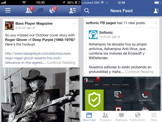
Moderate changes were a good bet for Facebook for iOS
The most common features are no longer hidden in the left menu (which was opened with the appropriate icon or with a flick of the finger from left to right on the screen), but always visible. Besides the usual friend requests, messages and notifications, you now have an even more handy search menu (which has assumed a predominant position in the upper left) and the newsfeed link to change your status, post a photo or check in.
The menu with the other tools has moved from the upper left to the lower right, and now sits on a pure white background.
Graphically, Facebook is perfectly suited to iOS 7. Whether the usability has improved is unclear, however, since the new, visible menu uses up valuable screen real estate. In terms of performance, we noticed a long boot time, but the updated app seems a bit more stable than the previous version. That’s definitely a good thing, because the performance of Facebook for iOS has always been mediocre.
Evernote
The king of digital notebooks has taken advantage of the introduction of iOS 7 to make significant changes. And these changes, are definitely for the better.
The old app wasn’t easy to navigate. It wasn’t that it was overly complicated, it’s just that there were a lot of features in a small space, and the oversized graphics of the app in iOS 6 weren’t clear. That meant that learning to use Evernote for iPhone took some effort and dedication.
The restyling for the iOS 7 release, however, has gone a long way toward improving usability. The results are positive.

Evernote took risks, and it paid off
The new Evernote offers a virtually perfect home screen, where everything is just a click away. The tabs are gone, and the last two notes you created are accessible directly from the home screen. The nice thing is that the organization interface is dynamic: the tools you use most often are shown and the others are hidden.
The Quicknote section (great idea!) lets you write a note, take a picture, create a reminder or make a to-do list of directly from the home page, thanks to the panel at the bottom of the screen.
Even the Notebooks and Tags screens have been improved and reorganized. Having been an Evernote user for several years now, kudos to Evernote for this wonderful new iOS 7 version. And the new emerald green background is beautiful!
Twitter has undergone a couple of changes since the app received its first iOS 7 styling. The latest iteration features several redesigned elements: the header is a solid color now, navigation icons have shrunk a few points and fonts are a little lighter than before. The compose button has a new icon, too.
The biggest change is Twitter’s decision to include small buttons for interacting with tweets, always visible below each tweet. Previously, users had to slide a tweet to the left to access these features. Possibly, interaction levels were lower than desired in the previous edition. But overall, Twitter’s deign changes for iOS 7 are subtle and a little less radical than we’ve seen elsewhere.

Twitter’s changes: a little more subtle
Foursquare
A fresh coat of paint and not much more. For the future, Foursquare Labs has promised a major update, but for now it’s changed very little. The interface is in line with iOS 7 and the icon is styled appropriately. The lines are thinner. But loyal users won’t notice much change. It’s still the same old Foursquare.
We’re hoping Foursquare’s next update is a little more exciting
The interface changed a few details, but they missed the mark. The space for displaying photos is slightly larger than in the previous version, which was swimming in frames. In general, the wasted space from before is now being used, but surprisingly this doesn’t weigh down the look.
The thumbnail of the profile picture for contacts has been rounded, and the results are aesthetically pleasing. The icons haven’t changed except on the profile page.
It’s a perfect example of how you can do a lot with relatively little.

Instagram got the most out of small tweaks
eBay
The icons have been adapted to the iOS 7 style, and now are gray and thin, with an off-white background instead of black. Even the fonts are consistent with the new operating system.
In this case, there’s also a feeling of greater space. From the point of view of features and organization, there’s been no major change, and the app works as well as it always has.
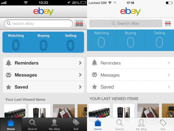
Ebay feels lighter and more spacious
So far, the most popular applications have limited themselves to a few cosmetic changes to adapt the look of their apps to the new two-dimensional environment of iOS 7. Only a few apps like Evernote took more risk by venturing onto the slippery slope of changes to the user experience.
The next time these apps update, think we’ll see something more daring?
If you want to know more about iOS 7, take a look at the index with all the news, articles and videos about the new mobile operating system from Apple.
Original article written by Pier Francesco Piccolomini for Softonic IT.